Have you ever played a game where the question has something to do with, “what color is this logo?” These types of games can be fun and challenging, and can test one’s visual perception and memory skills. They can also be a way to learn more about different brands and logos that we encounter in our daily lives. Usually there are reasons as to why a business chose the particular colors in their logo and that is very important to marketers. To ensure consistency and appeal to the target audience, businesses should follow color guidelines when choosing their brand colors. Here are some of those guidelines.
Brand colors have several applications, including a company’s logo, website color scheme, social media channels, business card design, and print and digital ads. For brick-and-mortar businesses, brand colors can also be applied to the store design, staff uniforms, product packaging, and more.
Choosing the right colors for your brand is essential to showcase your brand identity. The colors you select should mirror your values and the message you want to convey to your audience. A well-thought-out color palette can help distinguish your brand from competitors and create a lasting impression on your customers.
Colors matter with branding because they have a significant impact on how people perceive a brand. Different colors can evoke different emotions and feelings, and can even influence consumer behavior.
For example, blue is often associated with trust and reliability, while red can convey excitement and urgency. Green is often associated with nature and health, purple with luxury and creativity, and orange with energy and excitement.
Consistent use of colors throughout a brand’s visual identity can help to increase brand recognition and awareness. Choosing the right colors for a brand can play a crucial role in shaping its image and communicating its values to consumers.
 Primary Colors Versus Secondary Colors
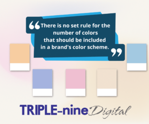
There is no set rule for the number of colors that should be included in a brand’s color scheme. However, it is generally recommended to use no more than five colors to ensure consistency and simplicity. Ultimately, the number of colors used should align with the brand’s values and messaging.
In branding, primary colors are often used to create a strong and memorable visual identity for a company or product. Different shades and tones of these colors can be used as secondary colors to convey different emotions and messages to consumers. Overall, the use of primary colors in branding can help to create a consistent and recognizable image that resonates with customers.
When choosing secondary colors, it is important to consider the emotions and values that a company or product wants to convey to its audience. The right combination of colors can make a brand more memorable and recognizable. Secondary colors are also not used as main colors in branding but just colors to possibly make the marketing pop or stand out from the competition.
Testing color schemes with print media involves several steps. First, choose a printer that can accurately reproduce the colors you want to use. Then, create a design using the color scheme you have in mind and print out a test copy. Make sure to check the colors under different lighting conditions to see how they appear in different environments. Adjust the color balance as needed and print another test copy. Repeat this process until you are satisfied with the results. It’s also a good idea to consult with a professional designer or printer for their expertise on color accuracy and print quality.
Digital color schemes refer to the specific set of colors used in digital design. These schemes can vary in the number of colors used, their combinations, and their hues, saturations, and brightness levels will matter. Digital color schemes are essential in creating visual appeal and conveying a particular message or mood in digital media, such as websites, apps, and social media graphics. It is also important to remember that the color can vary from screen to screen. There are a variety of factors that make colors look different on every screen such as differences in color calibration, display technology, and lighting conditions. Each device may interpret and display colors differently, resulting in variations in color accuracy and vibrancy. Additionally, the color profile used for an image or video can affect how it appears on different screens. Simply stated, the differences in screen technology and settings can cause variations in color perception, which is important to consider when creating or viewing digital content.

Creating a section in your branding guidelines specific to colors is important once a color scheme has been decided upon. This helps ensure consistency and cohesiveness throughout all branding materials.
Colors are communicated in various formats depending on their intended use. The most common color formats include hexadecimal (HEX), Red Green Blue (RGB), Cyan Magenta Yellow Key (CMYK), Pantone Matching System (PMS), Natural Color System (NCS), and Imperial Commission for Delivery Terms and Quality Assurance (RAL). Be sure to include this information in your guideline.
In the end, the importance of first impressions cannot be overstated. Your brand colors, often seen in your logo, are the first thing a consumer will notice about your company. It is crucial to make sure your colors accurately represent your brand and leave a positive and memorable impression on potential customers.